How to Choose the Right Door Sign for Your Business?
Choosing the right Door sign is more than selecting a material, color, or attractive typeface. It is a practical communication decision. Your sign must guide visitors, reinforce your brand, and remain readable under changing light. A customer should identify “Reception” or “Suite 204” within seconds, even while carrying a box or searching from a hallway.
Industry evidence supports this investment. FedEx Office’s Small Business Signage Impact Study reported that 76% of consumers had entered a store because its sign attracted them. The same study found that 68% believed a business sign reflected the quality of its products or services. These figures are useful, but they are not recent. Customer behavior, digital navigation, and accessibility expectations have changed. That limitation deserves attention.
Wayfinding specialists Paul Arthur and Romedi Passini described the purpose clearly: “Wayfinding is the process of reaching a destination.” Their principle still matters when comparing a lobby plaque with a projecting exterior sign. The correct Door sign depends on viewing distance, visitor movement, mounting height, contrast, finish, and maintenance. A glossy black panel may look elegant in a showroom, yet create glare beside a sunny glass entrance. Small details become visible problems.
This guide examines those choices through practical examples and professional sign-planning principles. It considers brand consistency without sacrificing clarity. It also encourages verification against current accessibility requirements and local building rules. A beautiful sign that visitors cannot read has failed its basic job. That sounds obvious. It is often overlooked.
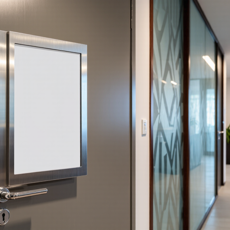
Define Your Business’s Door Sign Purpose and Location
Your door sign should solve a specific problem before it adds visual appeal. Decide whether visitors need identification, directions, reassurance, or a safety message. A name sign suits a private office, while a directional sign belongs where people hesitate, such as a hallway junction or lift lobby. Purpose comes first.
Location changes performance. Place the primary sign at natural eye level, near the door handle side, and within the visitor’s first sightline. Keep it clear of plants, promotional posters, and glare from glass. A 2012 national consumer signage survey reported that 76% of consumers had entered a business because its sign attracted attention. The same survey found that 68% believed signage reflected business quality. These figures support visibility, but they do not excuse oversized lettering. A sign can be noticed and still feel confusing.
Test the sign from the pavement, not only from the designer’s screen. Stand where a first-time visitor would stand. Check viewing distance, evening lighting, contrast, and whether the door opens across the text. Accessibility guidance also recommends tactile characters and Braille for many permanent room signs, with consistent placement helping users locate them. Confirm local requirements before production. Small details matter. I once saw a polished sign hidden behind a door swing. It looked professional, but failed its purpose. The better question is simple: what must a visitor understand here, within three seconds?
How to Choose the Right Door Sign for Your Business? - Define Your Business’s Door Sign Purpose and Location
| Business Sign Purpose | Recommended Location | Suitable Sign Type | Recommended Material | Typical Size Range | Visibility Priority | Key Selection Considerations |
|---|---|---|---|---|---|---|
| Identify the business or department | Main entrance door or reception area | Permanent identification sign | Acrylic, aluminum, wood, or rigid PVC | 20–60 cm wide × 10–30 cm high | High; readable from the approach path | Use clear wording, strong contrast, durable mounting, and a finish that matches the building interior or exterior. |
| Direct visitors to the correct room | Office, meeting room, consultation room, or classroom door | Room name or room-number sign | Acrylic, aluminum composite, or engraved plastic | 15–30 cm wide × 10–20 cm high | Medium to high; visible before reaching the door | Keep the room name or number prominent. Avoid decorative graphics that reduce legibility. |
| Show whether a room is available | Meeting rooms, treatment rooms, interview rooms, or service counters | Changeable status sign | Sliding acrylic, magnetic panel, or interchangeable insert | 15–30 cm wide × 10–20 cm high | High at close viewing distance | Choose easy-to-update wording such as “Available,” “In Use,” or “Please Wait.” |
| Protect privacy or restrict access | Staff-only doors, storage rooms, records rooms, or back-of-house areas | Restricted-access or staff-only sign | Aluminum, engraved plastic, or laminated rigid PVC | 15–30 cm wide × 10–20 cm high | High contrast at eye level | Use direct language such as “Staff Only” or “Authorized Personnel.” Confirm wording with internal security procedures. |
| Communicate safety information | Fire exits, electrical rooms, maintenance areas, or hazard zones | Safety or warning sign | UV-resistant aluminum, rigid PVC, or photoluminescent material where appropriate | 20–45 cm wide × 15–30 cm high | Very high; readable quickly from a practical distance | Use recognized safety colors and symbols where applicable. Check local fire, building, and workplace-safety requirements. |
| Support accessibility and inclusive navigation | Permanent room identification near the latch side of the door | Tactile and Braille room-identification sign | Acrylic, engraved plastic, or other durable tactile substrate | 15–30 cm wide × 15–25 cm high | Readable visually and by touch | Use raised characters and Braille when required. Placement, character specifications, and mounting height should follow applicable accessibility rules. |
| Promote a service or department | Customer-facing entrance or service-area door | Decorative informational sign | Acrylic, wood, metal, or printed composite panel | 25–60 cm wide × 15–35 cm high | High; visible from the customer approach direction | Limit the message to the service name and one supporting phrase. Keep the design consistent with the surrounding wayfinding signs. |
| Provide temporary instructions | Temporary closure, alternate entrance, renovation, or event area | Temporary adhesive, poster, or reusable panel sign | Laminated paper, corrugated plastic, removable vinyl, or lightweight PVC | 20–45 cm wide × 15–30 cm high | High for the duration of the instruction | Include a concise action, directional arrow when needed, and an end date if the information is time-sensitive. |
| Improve exterior entrance recognition | Exterior entrance door, gate, or access vestibule | Outdoor identification or entrance sign | Powder-coated aluminum, stainless steel, weather-resistant acrylic, or exterior-grade PVC | 30–90 cm wide × 15–45 cm high | Very high; consider daylight and nighttime conditions | Select UV-, moisture-, and temperature-resistant materials. Verify door clearance, fixing method, and local exterior-sign permissions before installation. |